Migrate Digital Quilting Design on Spring in Paris Quilt
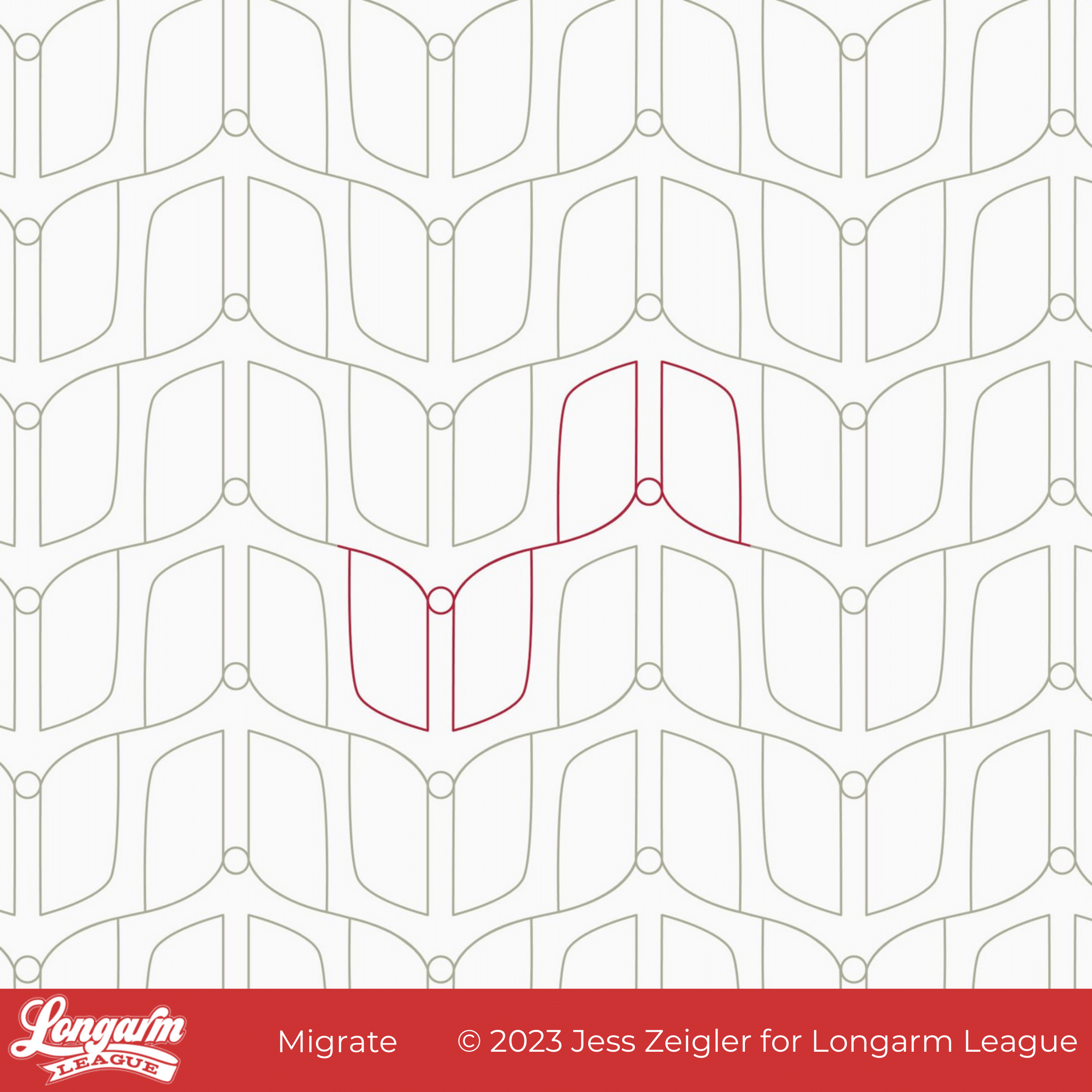
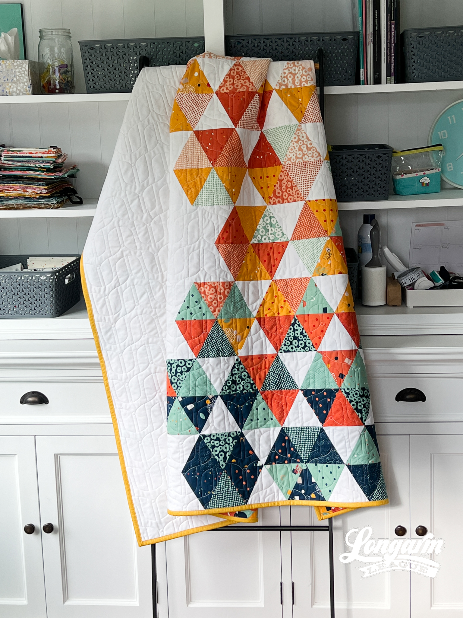
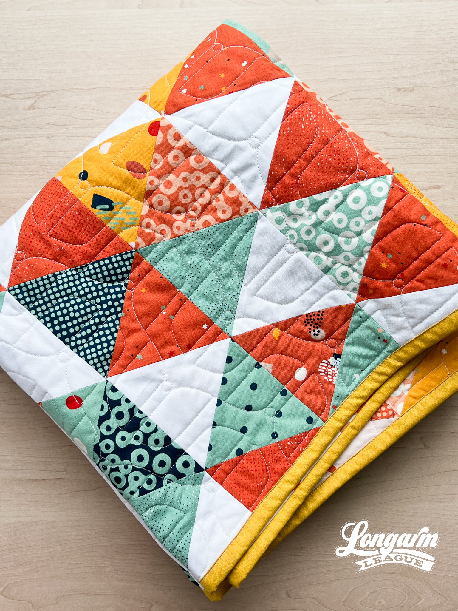
Migrate is a digital pantograph design that came about as I played with the elongated, mirrored "wing" shapes you see here. Only after looking at it for a while did it remind me of a minimalist butterfly shape and that's where the name came from.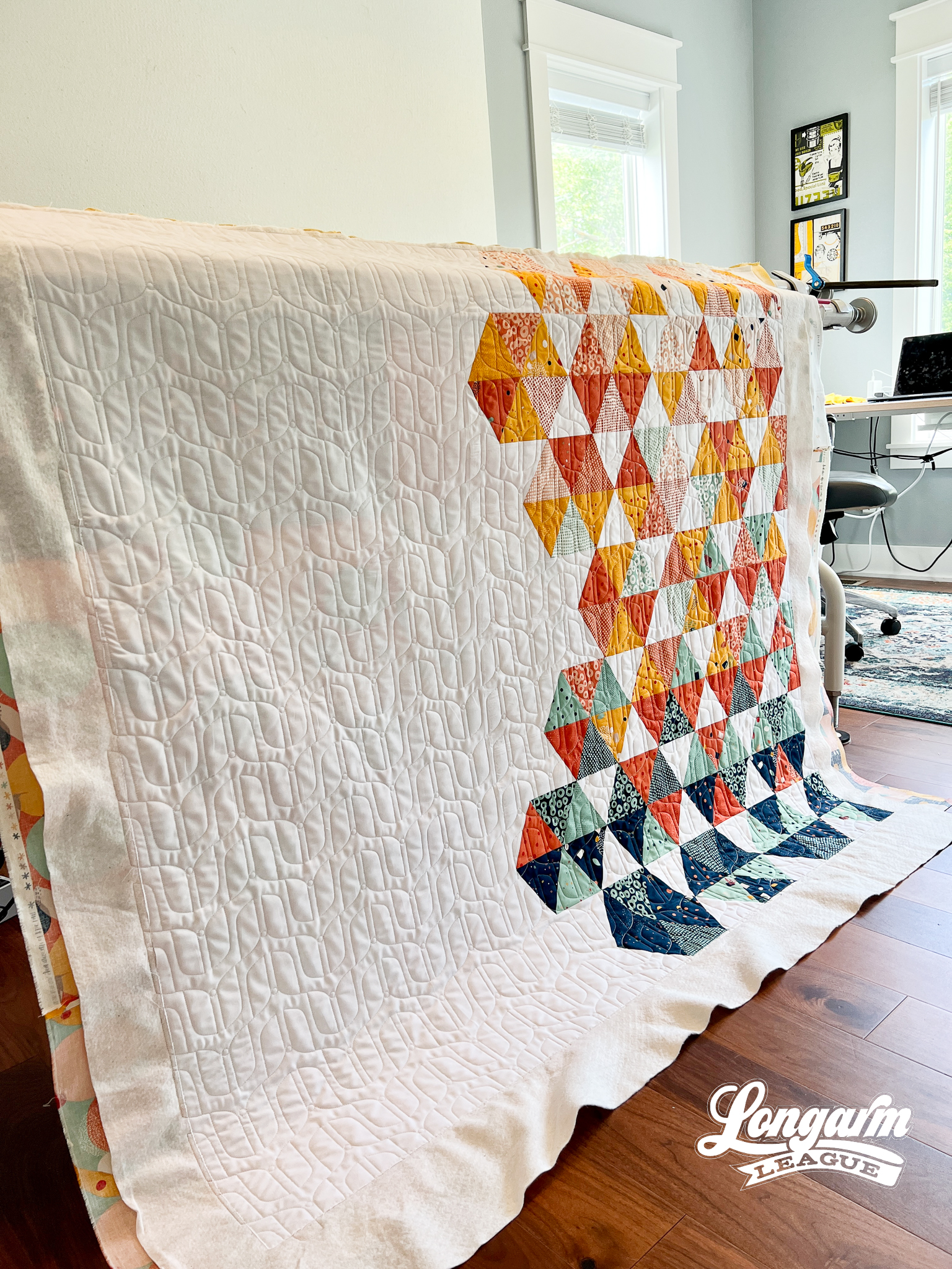
But you don't have to like butterflies to use this design on a quilt top! It's abstract enough to work on a lot of different styles. It would even work for a mid-century modern look.
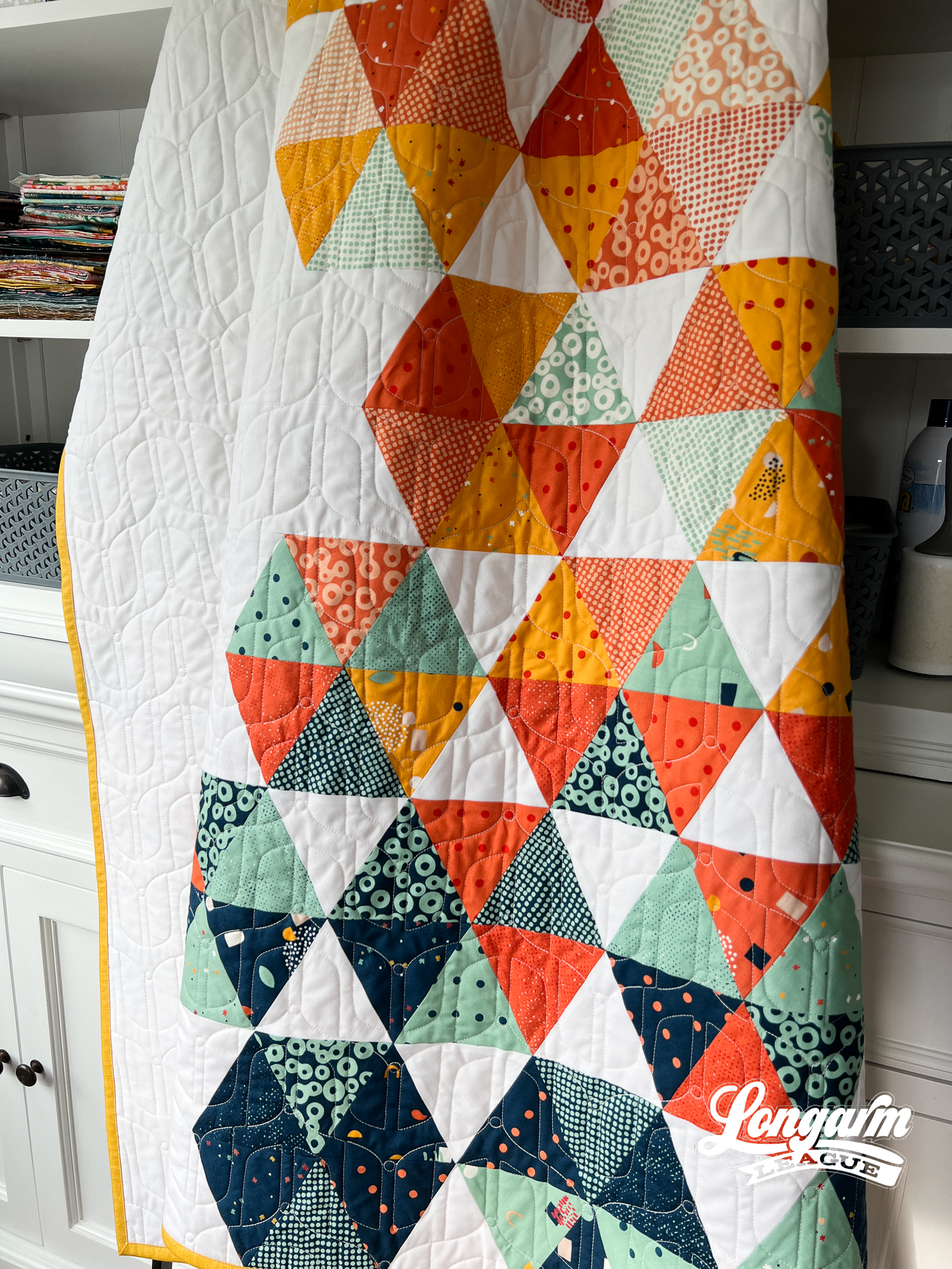
There is some backtracking involved in this design, so if you're curious about that, watch the video of the stitch-out at the top of this blog post.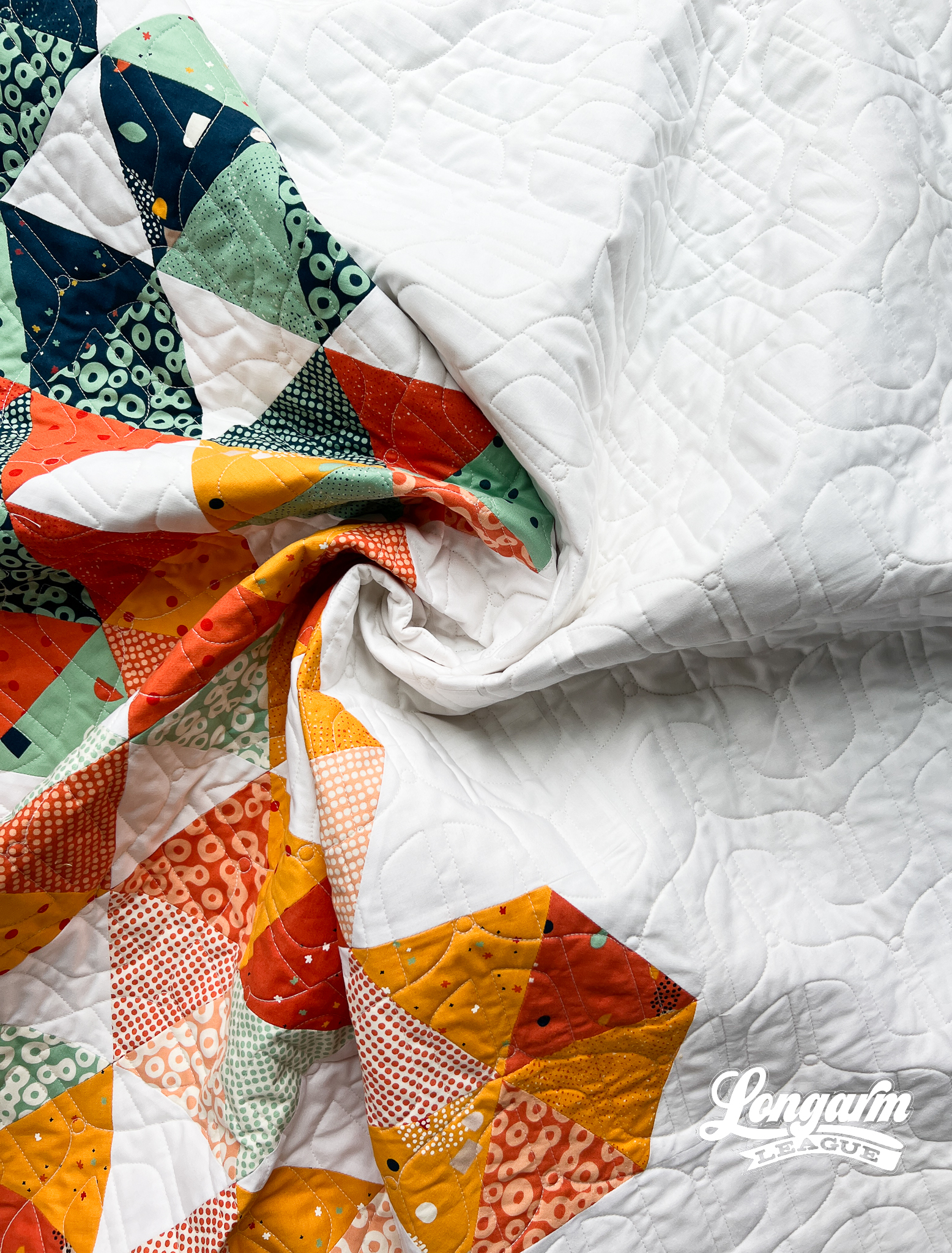
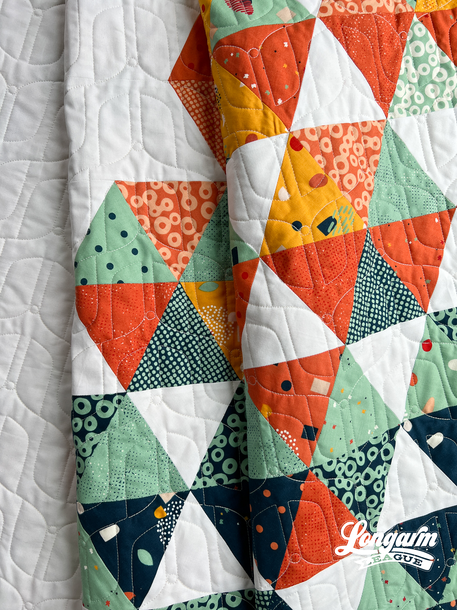
The Quilt
I have to admit, I pieced this quilt top specifically to test a different pantograph design. I loaded it up and quilted three rows of the intended design until I was sure it was a no-go. Sometimes my ideas on the computer don't quite translate well to real-life applications. It's a bummer, but that's life. That means more tweaking is needed until I'm happy with the design or it'll get scrapped altogether!
I typically have many irons in the fire design-wise, so I pulled out another option to test—this one called Migrate.
But, back to the quilt.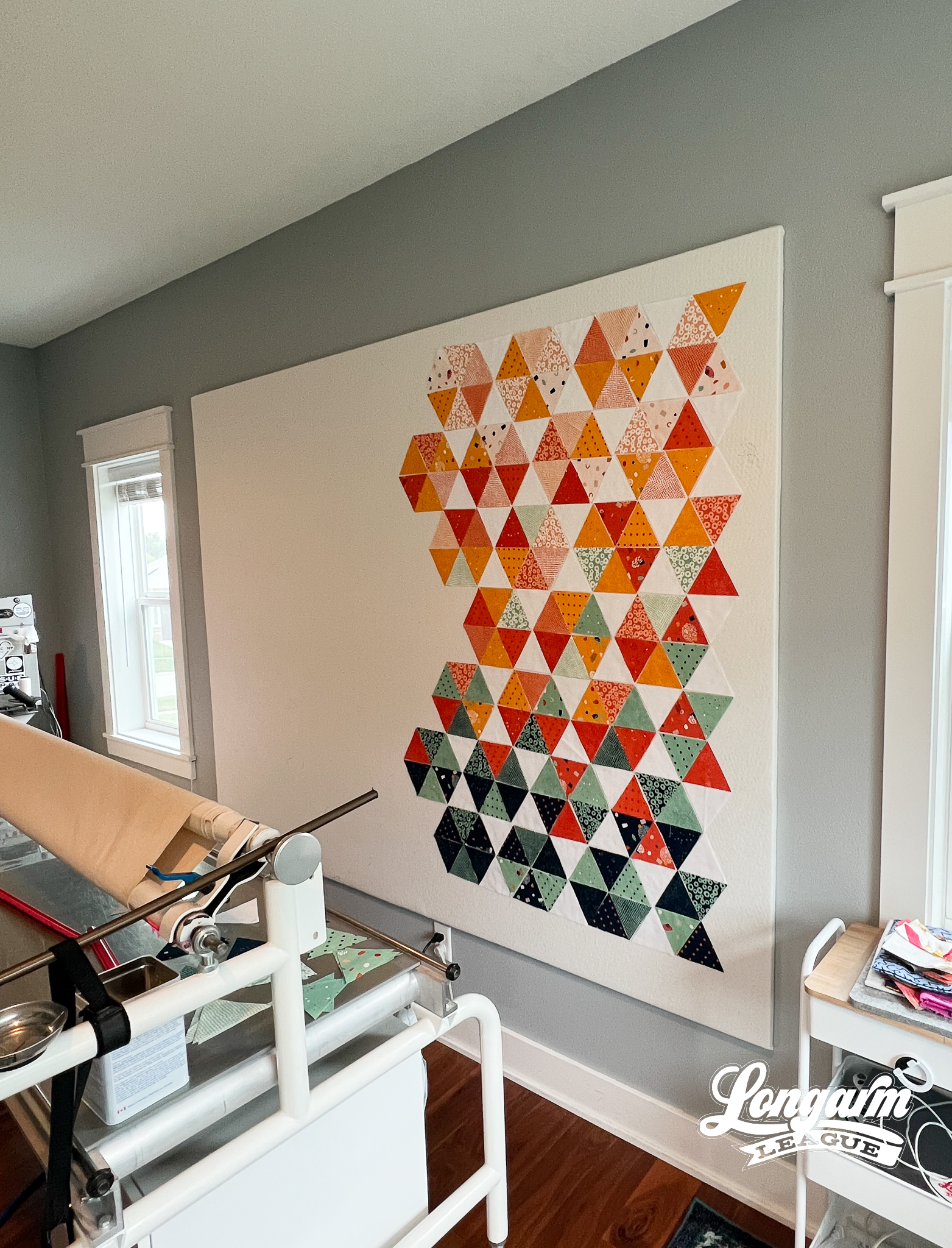
I'd been googling minimal quilt patterns and saw this patchwork pattern. It's called Spring in Paris by Brigitte Heitland of Zen Chic. All of the negative space appealed to me—you know, since I was going to use this quilt as a canvas to test a new design.
I decided to go for it when I looked at the fat quarter bundle I was planning to use and discovered it was also by Zen Chic! I love this designer's style.
The fabric line is called Frisky, and I adore the palette! All too often, I gravitate toward sewing with blues and greens in my patchwork. I loved how this collection bridged warm colors with my familiar cool colors.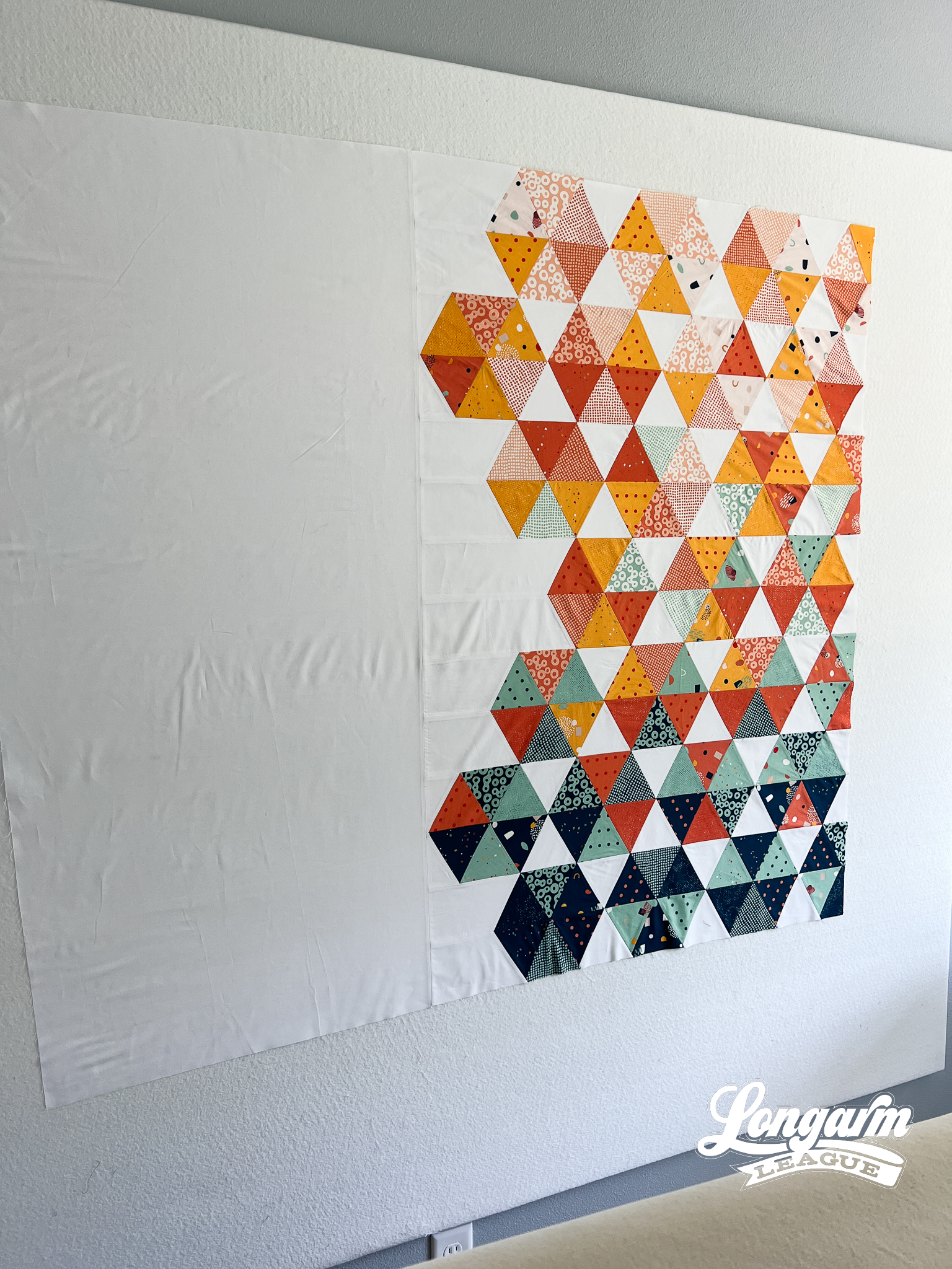
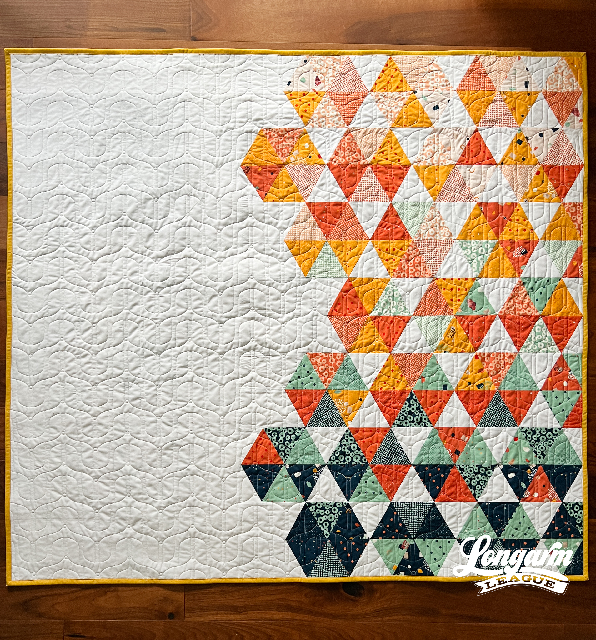
The pattern's cover quilt (shown here) featured a lovely gradation in a different fabric line, so I took that inspiration and used the amazing prints in Frisky to work my way from the lighter and warmer tones at the top to more saturated and cool at the bottom of the quilt.
Finalizing the fabric placement took a lot of stepping back and re-arranging on my design wall. Check out this blog post here to see how I use a design wall in the otherwise cramped space behind my longarm. I'm still so glad I have a design wall now!
There are so many fabulous prints in this line. Many fat quarters in the bundle went untouched, so I used some remaining medium- and large-scale prints (because I otherwise struggle to use these in my quiltmaking) to make a pieced backing.
I still have so much fabric left! Now that I've used it as a collection, I think I'll "de-commission" it by mixing it into my stash according to color. I look forward to incorporating this line into future projects.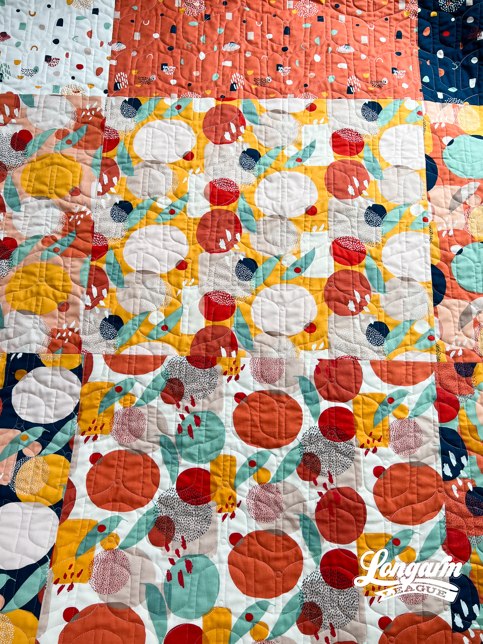
The Quilting Details
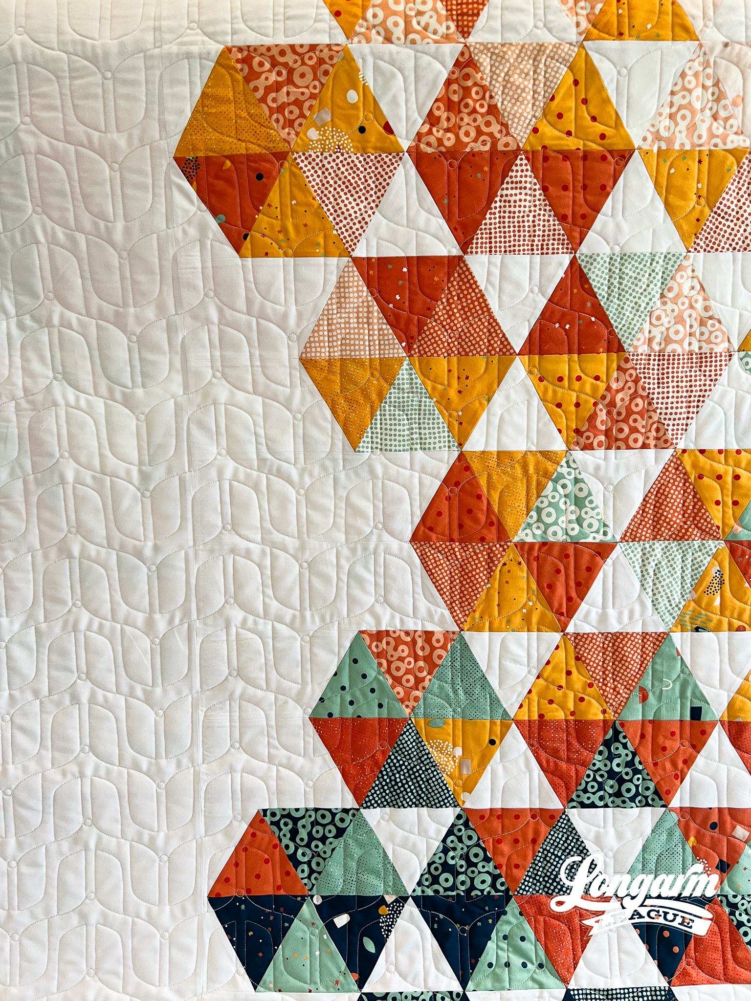
I mentioned this earlier, but there's a video of the stitch path at the top of this blog post to see where the backtracking/over-stitching occurs.
Here are the sizing specifications for how I set up this design using my Intelliquilter (56" x 51" quilt size):
Row height: 3"
Gap: -2.454"
Pattern height: 5.454" (measurement from top to bottom of the repeat)
Offset: none
Backtracking: some
Between you and me, I wish I had nested the rows just a bit closer when I stitched this out. I think I'll close the gap a bit more when I use it again.
Here's a look at the included PDF: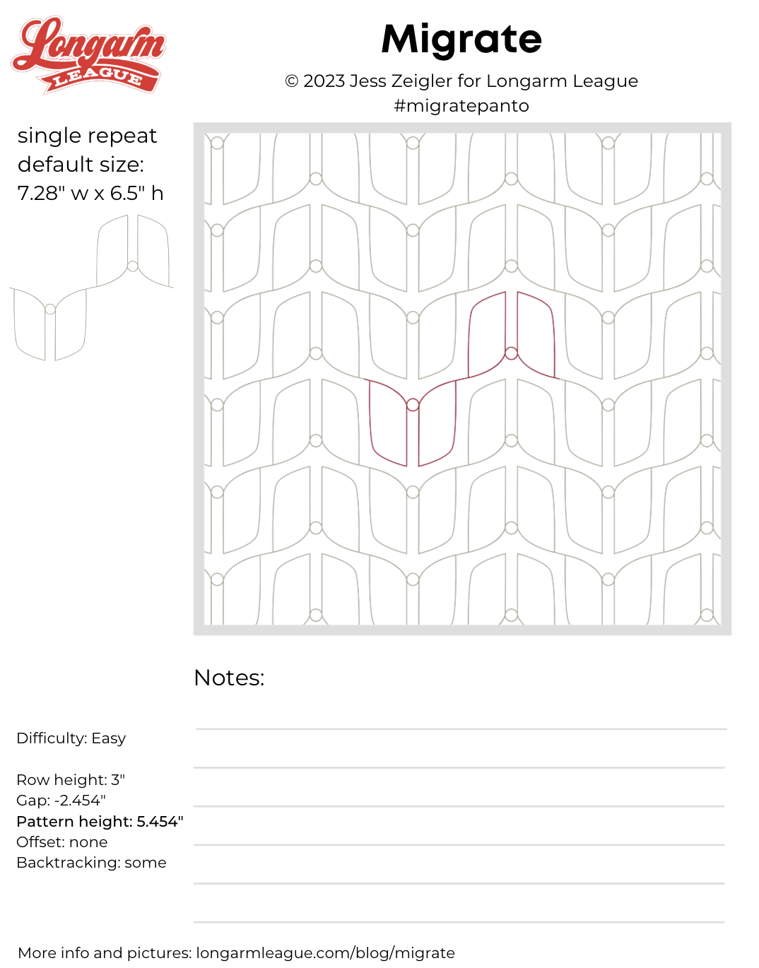

If you use Migrate on a quilt, we'd love for you to use the hashtag #migratepanto and tag @longarmleague on Instagram so we can see how you use it! You can also visit our full digital design shop to take a look at all our previous designs.
Interested in getting new digital pantograph designs like this one on the day they're released (and at a deep discount)? Sign up for our Digital Panto Club and get them delivered straight to your inbox on the first Wednesday of each new month.


