Mountain Rescue Quilt with Friends of P Quilting
We moved into our current house four years ago.
When looking for houses, we fully planned to buy a ranch style home. I had long imagined how I'd take-over a hefty part of a beautifully finished basement. Yes, I was preemptively greedy about this imaginary space.
But, when the house we'd mentally moved into sold before we were in a position to make an offer, I saw what ended up being "our house" online with its glass studio doors right off the living room, and I knew I could deal with another option. I'm trying to sound chill—the house was BEYOND what I ever envisioned for our family, so I was thrilled beyond belief.
I was so taken with the house and the sewing room that the lack of closet or storage space didn't even occur to me. Even after using the room for years, I still didn't think the lack of storage was an issue I could do anything about.
Until a few months ago...
I was scrolling Instagram and saw in Stories that Lindsey from Pen and Paper Patterns was giving details about her bookcases. For the first time, I realized that a bookcase would be a great option to make up for the lack of closet space in my room!

I ended up with the bookcase above that I found on Wayfair after weeks of searching and another few months for delivery. It's from the brand Sand and Sable, and I love it! I was going to order something less expensive from Ikea, but wouldn't you know—I could not find anything I wanted in stock for the size I needed to fill this particular space.
I was surprised today to revisit a similar listing and see the price is over $2k more than what I paid a few months ago! I did wait for a sale before I ordered, but still! It was a big stretch mentally to spend "that much" on furniture, but it's big (approximately 70" x 86") and solid and worth it. I'm really happy with how it fits in my room, how it looks, and the fact that it solved my storage problem!
The gray plastic bins on the shelves are ones I picked out many years ago when I needed simple storage for fabric that I didn't think anyone would ever see in my basement. I would likely choose different baskets now, but it's also not worth it to me to invest in something new or spend any brainpower thinking about it. I honestly do not like doing "house stuff" like this - meaning any kind of shopping or decision making.
Can you tell where this story is going?
When I moved my fabric and other projects from various tubs and shelves and drawers in other parts of my house to my new bookcase, I found an old WIP!
View this post on Instagram
First of all, I LOVE this pattern called Mountain Horizon by Lo and Behold Stitchery. I had completed the blocks you see in the Instagram post above (August 2018) but I'd also finished a lot of blue strip-pieced block-halves. I realized I only needed to piece four more to make nicely sized lap quilt.
At this point, I made the decision to take the blocks apart and use the blue halves for a repurposed quilt instead of finding the pattern and doing more curved piecing. I grabbed Kona Silver yardage I already had and used it to complete each block.
I think it'll be fun to incorporate the little curvy segments shown above into a future project. I mostly love the colors and fabrics I originally picked for this, but I do wish I would have chosen another color for the triangle portions surrounding the curved piecing. I think it would have made a punchier impact.
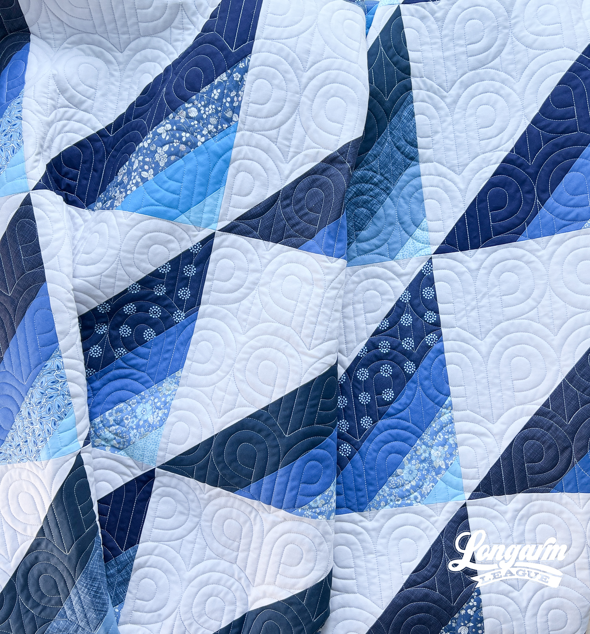
I was basically left with giant half-square triangle units. Instead of placing them on-point like in the original pattern, I set them out in two different options before deciding on the final placement. I was very motivated to just make a decision and go with it, taking the easiest route to finish.

The blocks finish just under 12" square. I arranged them 5 across by 6 down, making the quilt's final dimensions around 59" x 71".
When it came to the quilting step, I knew I wanted something modern-looking and curvy to contrast the angles of the piecing. As I was scrolling through my Intelliquilter for options, I came across one of my own designs that looked like it'd be perfect for this top! It's called Friends of P.

If I were to analyze it, I'd say that the fabric strips mimicked the echoed lines of the "P" shape in the design, and that's what pulled my attention toward it.


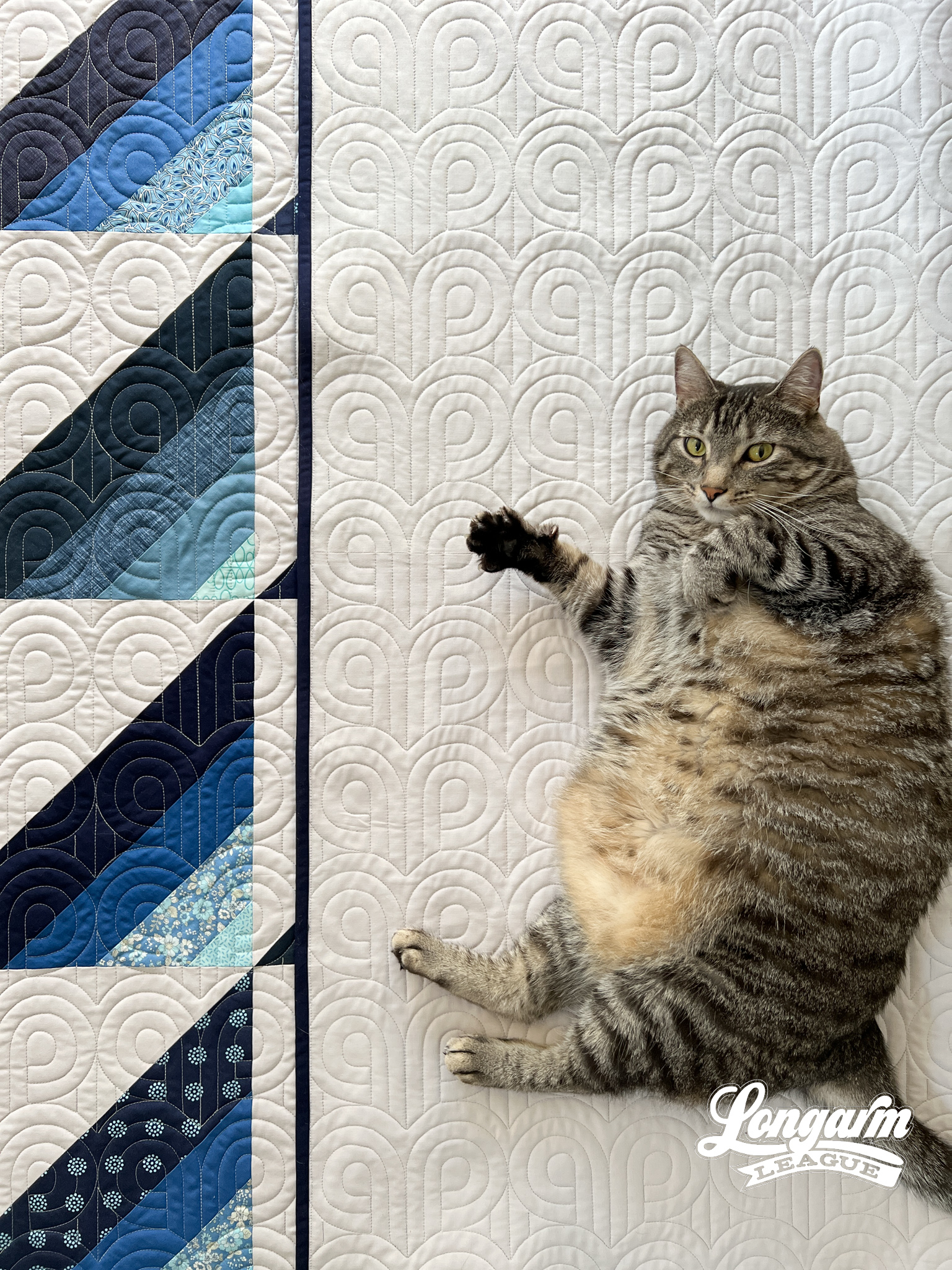
Jarvis just wants to be included in my photo shoots, he doesn't even care if we capture his best angle or not.

It didn't occur to me at the time because I was simply using the dimensions I've used previously for the sizing of the pantograph*, but this is a good example of using the rule of thirds to scale a digital pantograph.
When compared to a block size of (almost) 12", you can see the individual rows take up about one-third of that height. It looks pleasing to the eye this way! The rule of thirds is a composition principle that I've most commonly heard in reference to photography, but would assume that it's used in other artistic disciplines, as well. Btw, I credit Shelly from Ma Tante Quilting for applying this concept to quilting. So helpful!
*(Row Height: 4", Gap: -.396", Pattern Height: 4.396" - a blog post about this design can be found here)

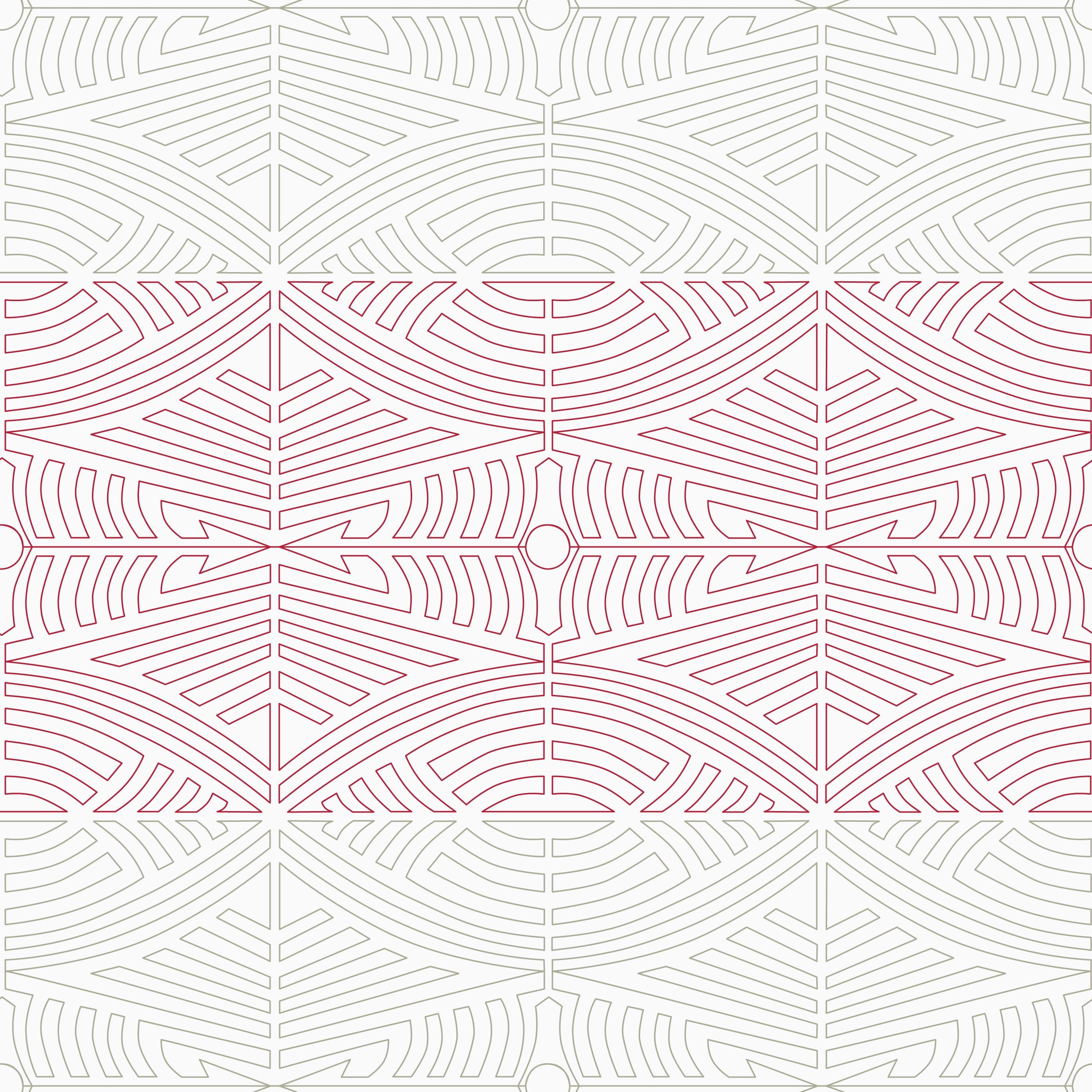
Of course, the rule of thirds doesn't work for every digital design. It depends on what kind of pantograph you're considering. If it's a dense B2B design (for example, my Arrow design shown below), it'd be totally inappropriate to shrink it down to 4" rows in the same manner as Friends of P. It'd be way too dense, it'd take too long to stitch out, and it'd look too busy.
But for simpler, less complex digital repeats, using the rule of thirds could be a great place to start!
I commonly hear that determining the scale/size of a digital design is an intimidating decision to make, especially for folks just starting out with computerized quilting. It's nice to have a jumping off point like the rule of thirds to fall back on!
While we're on the subject, to help address the issue of sizing, we've created a user-uploaded database in the Longarm League membership. It's a listing of commercially available digital pantograph designs that shows photos of the design stitched out on a quilt along with the exact sizing used, where to purchase the design, other setup and ease-of-use notes. If there's anything particularly tricky about the design, there's a notes field for that, too!
And sometimes, our Pantograph Database is really useful to browse when you need a refresher of what's out there as far as designs/designers/websites. After all, quilter's block is real and sometimes we just need to browse ideas.

I ended up using the same Kona Silver yardage that I used for the blocks as the backing because I didn't want to take the time to piece a scrappy backing. Actually, I started pulling fabrics for the back and realized it was going to be as much work as another quilt top. No thanks! I'll save that pull for another project.
I'm really happy with how this newly rediscovered-and-completed top came into place. That's why I'm jokingly calling this "Mountain Rescue" and not the original inspiration, Brittany's Mountain Horizon pattern, which I just want on record is the clear winner in terms of beauty and creativity. Not that quilts have to compete, I'm just saying that mine is the Kirkland version.
Not to brag, but I also MADE AND APPLIED the binding for this quilt immediately after quilting it. That never happens and <sarcasm> I feel like I deserve an award for my valiant efforts </sarcasm>. I didn't even have a deadline! I got swept up in the Sherlock Holmes audiobook that is approximately 56 hours long (not kidding) and found myself having the best time. You don't have to tell anyone that; it sounds like the nerdiest sentence I've ever voluntarily typed. Oh wait, the audiobook is actually 63 hours long, I just looked it up! I'll be dipping in and out of that audio for the foreseeable future.


