Demure Edge-to-Edge Digital Quilting Panto

What good is the Internet if you can't use it to jump on a trend? The first time I saw something relating to "very demure" was an Instagram Reel of a real estate agent in Des Moines, describing the city as "very demure". I thought that was an odd way to describe it, but I continued with my day. In a short amount of time, I saw "very demure, very mindful" pop up in so many other places that I had to google it. Apparently, it originated with TikTok influencer Jools Lebron as a way to describe her look and way of being. It has caught fire from there! Now "very demure, very mindful" is a phrase that is popping up everywhere, and just when I needed a name for my new design. It fits, doesn't it? 
Demure's design starts with the outer petals and ends with the medaillion-like framing around a center circle. The repeating shape is elongated. 
Every other row is staggered at 50% with this design. When arranged, the row-to-row nesting is minor and is not challenging to align when stitch...
Plus Edge-to-Edge Modern Quilting Pantograph Design

Just so you know, the only thing I was thinking about when I was designing this new edge-to-edge pantograph was hot dog buns! I was going for that rounded shape. In the end, I thought the name Plus sounded more mature than Hot Dog, which was the temporary file name until that final save.
I think this quilt top paired so well with the design! Usually, I have a small stack of quilt tops waiting for a new design to test out, but in this case, I was reminded of the Peanut Butter pattern as I was looking through Instagram posts I'd saved, and I made the quilt top just to use for this Hot Dog—I mean Plus!—design.
The design has just a bit more complexity than I'd like, but I couldn't find a way around it. When the stitch path is almost completed, it pivots direction to backtrack across the top horizontal line of the plus shape on its way to start another repeat. I tried bisecting the design with a straight line through the middle, but I just didn't like the way it looked compared t...
Lateral Extended-Width Modern Quilting Design

Lateral is a new extended-width design that is somewhat small in scale (more on that later) and great for providing lots of background texture that won't get in the way of a quilt's patchwork.
If you are new to extended-width pantograph designs, I'd encourage you to visit this blog post that provides more information and help with set-up. These designs are different than traditional edge-to-edge designs and may require different configurations or settings with your software. This design, in particular, includes six whole rows of quilting with the stagger (or offset) between rows built into the design.
I started fiddling with this design by manipulating one long and narrow teardrop shape. After lots and lots of futzing, and once I had it arranged as shown throughout this post, I realized how much it looks like a Wishbone variation! That was not the plan, but it totally "works" for me and here's why:
- Lateral is named that way because it emphasizes side-to-side movement, ...
Hexlow Extended-Width Digital Quilting Design

I started working on the Hexlow design a few years ago, but it wasn't until I made this quilt pattern called Jelly Stars by Modernly Morgan, that I knew I wanted to revisit the quilting design and get it ready for use.
If you are new to extended-width pantograph designs, I'd encourage you to visit this blog post that provides more information and help with set-up. They are different than traditional edge-to-edge designs and may require different configurations or settings with your software.
In the blog post I linked above, I explain one of the reasons why I love using extended-width designs as a format, and that's to maintain spacing throughout the design. This design just wouldn't have the same flow as a standard edge-to-edge repeat.

The Quilt
I was in Wisconsin for a quilting retreat and shopped at the Stitch Supply quilt shop located in Altoona. I picked out a jelly roll (precut 2.5" strips) from the shelf and added it to my shopping basket because of the fun colo...
How to Use Extended-Width Quilting Designs with Handi Quilter Pro-Stitcher Premium
In an effort to build resources for computerized quilters, I've been looking for tutorials that explain how to set up extended-width designs with the various software options available today. Betsy Green of The Salty Stitcher Quilt Company created this video for setting up designs with Pro-Stitcher Premium. Thanks so much, Betsy! We hope it's helpful to you if you'd like to explore extended-width designs.
The design she uses in the demonstration video above is Driftwood.
All of the Longarm League extended-width designs come with a PDF that provides the default dimensions. If I use a size different from the default in my examples, they will be noted in the design's blog posts, shop product listings, and PDFs. If you are prone to getting thread breaks when quilting in the right-to-left direction, my files also come with L to R versions that I'd recommend using instead.
For general information about extended-width designs, read this article. Questions or concerns? Let us know by email: lon...
Explore Edge-to-Edge Quilting Design
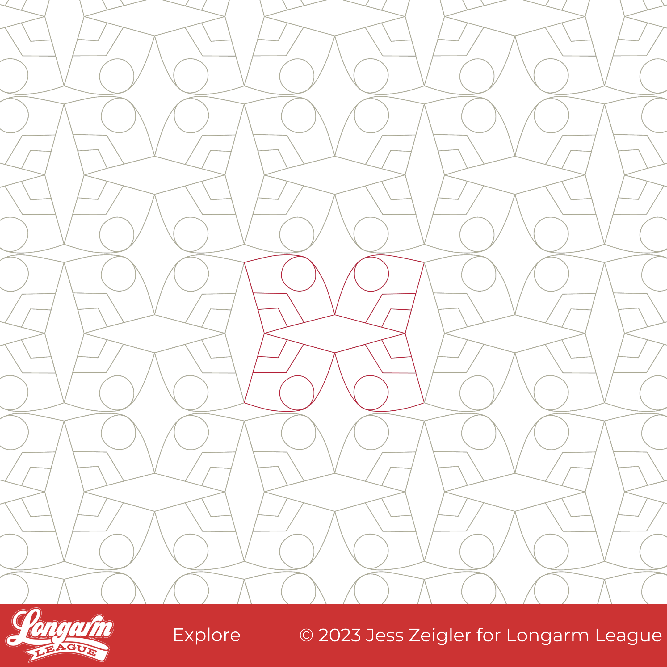
What started as a baseball diamond shape morphed into something that looked reminiscent of a graphic for America's National Parks. From there, I repeated the shapes at odd angles so that some secondary and tertiary diamonds emerged, but the "explore" feeling from an imagined poster never left.
What I like about this design is the graphic boldness of straight lines, angles, curves, and circles all playing together.
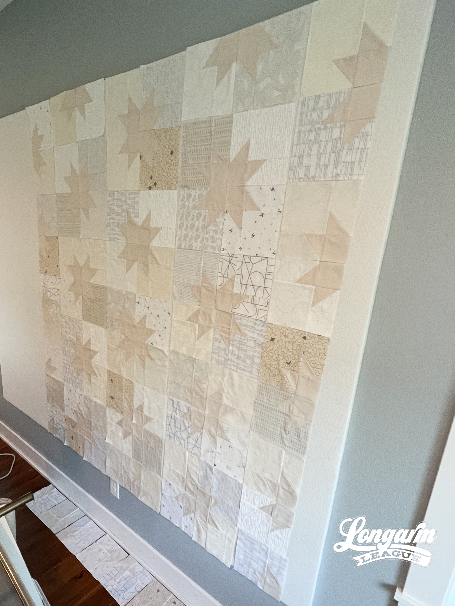
I found it funny that because I used such low volume AND extremely low contrast fabrics in this quilt, the quilting design pretty much swallowed up the whole quilt pattern! I was shocked by how little I could see the quilt pattern after quilting. Oops!


The Quilt
Believe it or not, this quilt is the Star Pop II quilt by Emily Dennis of Quilty Love. Here it is on my design wall before quilting as proof there were stars involved. Ha!
And then, after quilting: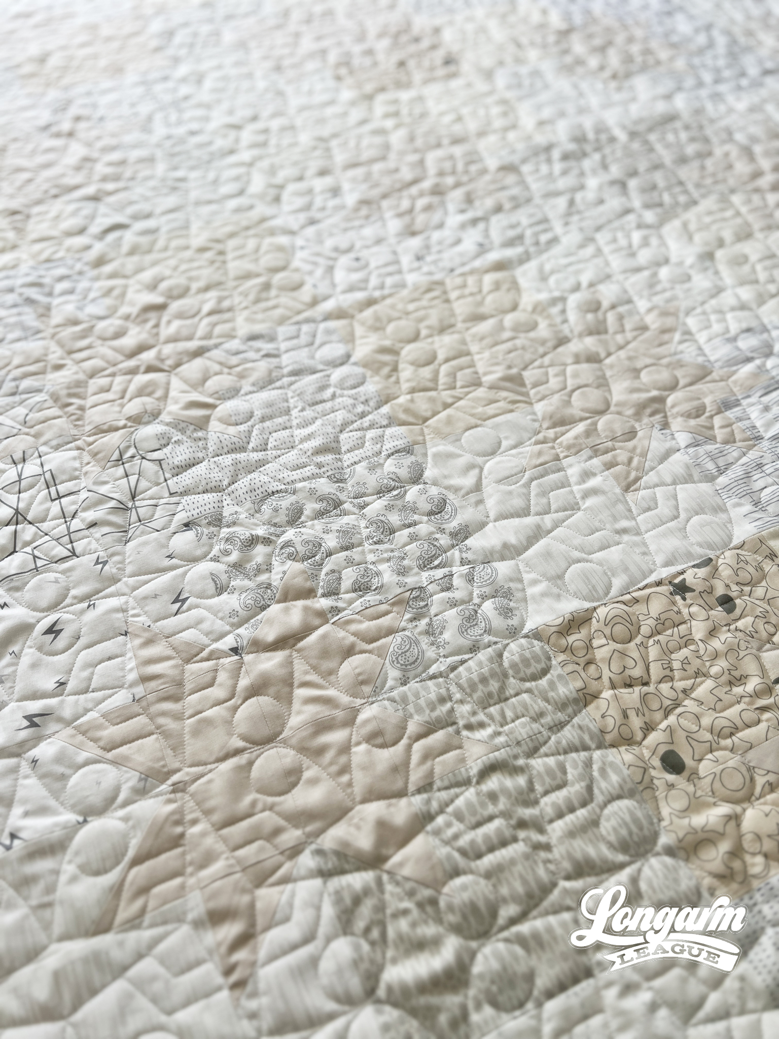
To be sure, I knew that the patchwork would be subtle. It was intentional. This was a wedding quilt for a...
Clamour Bundle - Four E2E Clamshell Quilting Designs with Many Options
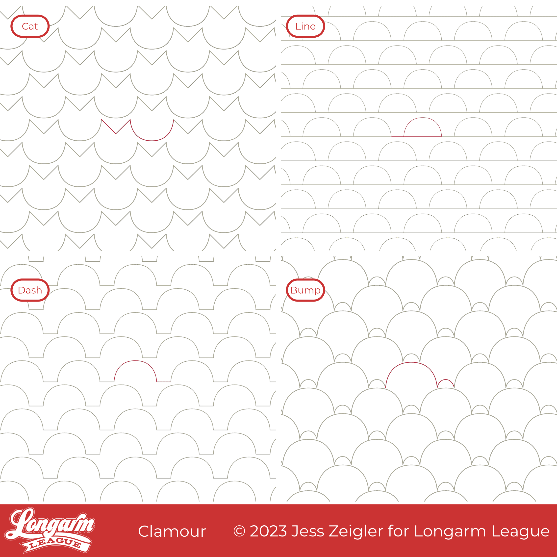
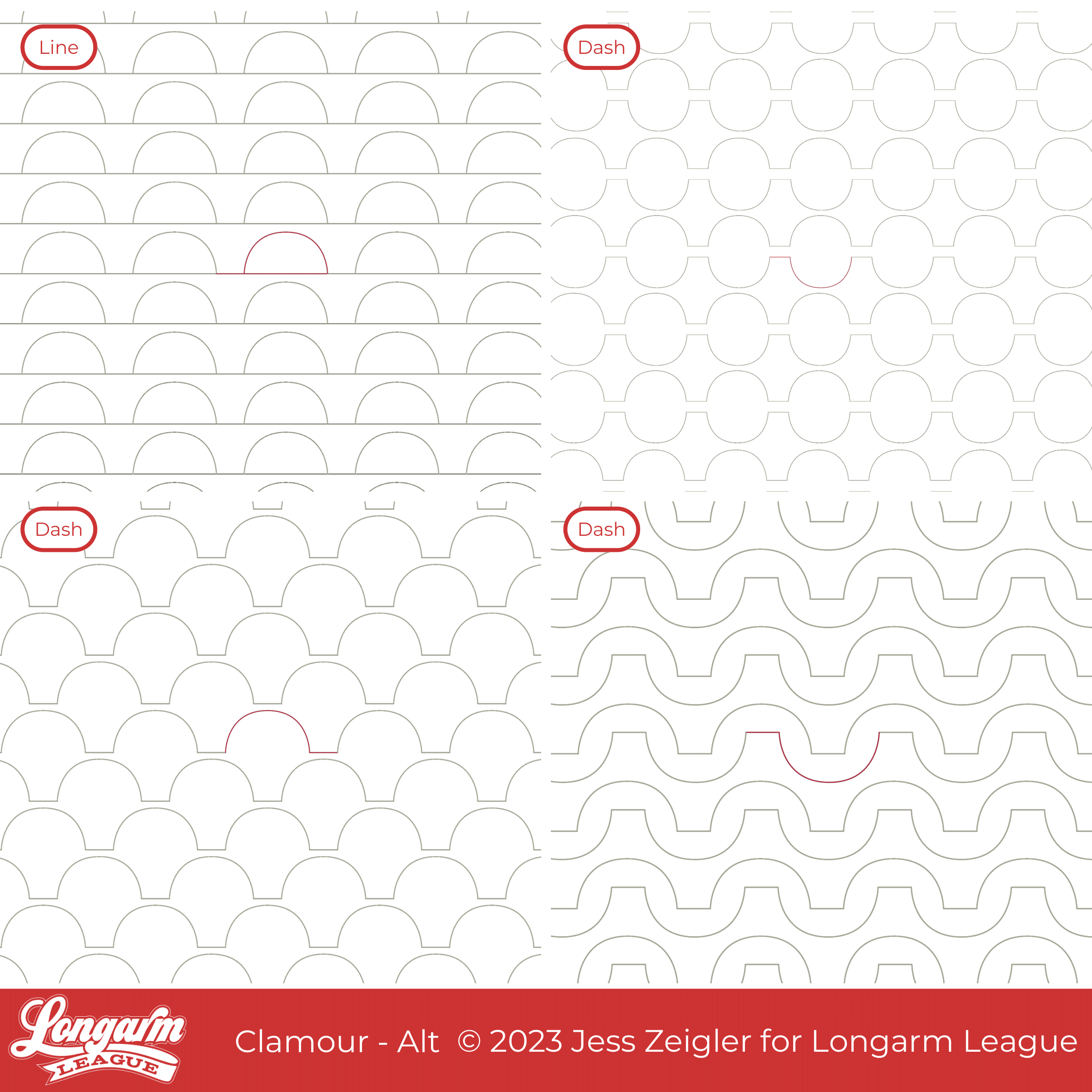
Hello friends! I'm showcasing a bundle for you today. Instead of narrowing a variety of clamshell designs down to one, I've bundled them together so that you can have many options!
There are FOUR edge-to-edge designs included in the Clamour bundle:
Cat
Line
Dash
Bump
All of this started because the Des Moines flag inspired me. I live in the Des Moines metro area, and the flag below represents bridges in the city. I created a few simple clamshell shapes designed to have some spacing between the clamshells, one with a line traveling under the clamshells (or on top if you'd like to flip it vertically like bunting) and one with a short line between. In the bundle, these are represented by Line and Dash.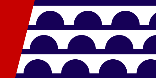
From there, I stumbled upon a variation that looked like cute cat heads in a simple and easy stitch path, so I knew I needed to include it too. We have a cat-friendly (cat-laden?) household, if you haven't met me yet. 👋

Let's talk about the Cat option now, because that's what I ...
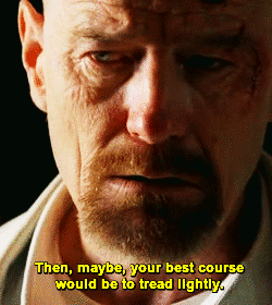
Tread Lightly Modern Digital Quilting Edge to Edge Design on a Vintage Quilt

 Tread Lightly is named as such because of an embossed design I came across on Pinterest that looked like shoe tread... I don't think it was, but it very much could be, don't you think?
'Tread lightly' is also a key phrase used in a pivotal moment in the series Breaking Bad. Since we watched that series again with our teenagers recently, it was fresh in my mind. Oh boy—on the last watch-through, I really hated Walter White! But that's a topic for another day.
Oh yes, back to "shoe tread". This design is sort of like a simplified serpentine meander with a well-placed circle within each shape. The alternating blob directions—pointing up and then down—make for an interesting way to fill space and result in easy-to-nest rows.
It's always nice to have some wiggle room when realigning an edge-to-edge design.

The design is quirky and fun and would be great for kids quilts or any modern top. I was so excited to use it on this vintage top that was gifted to me—it very much fits t...
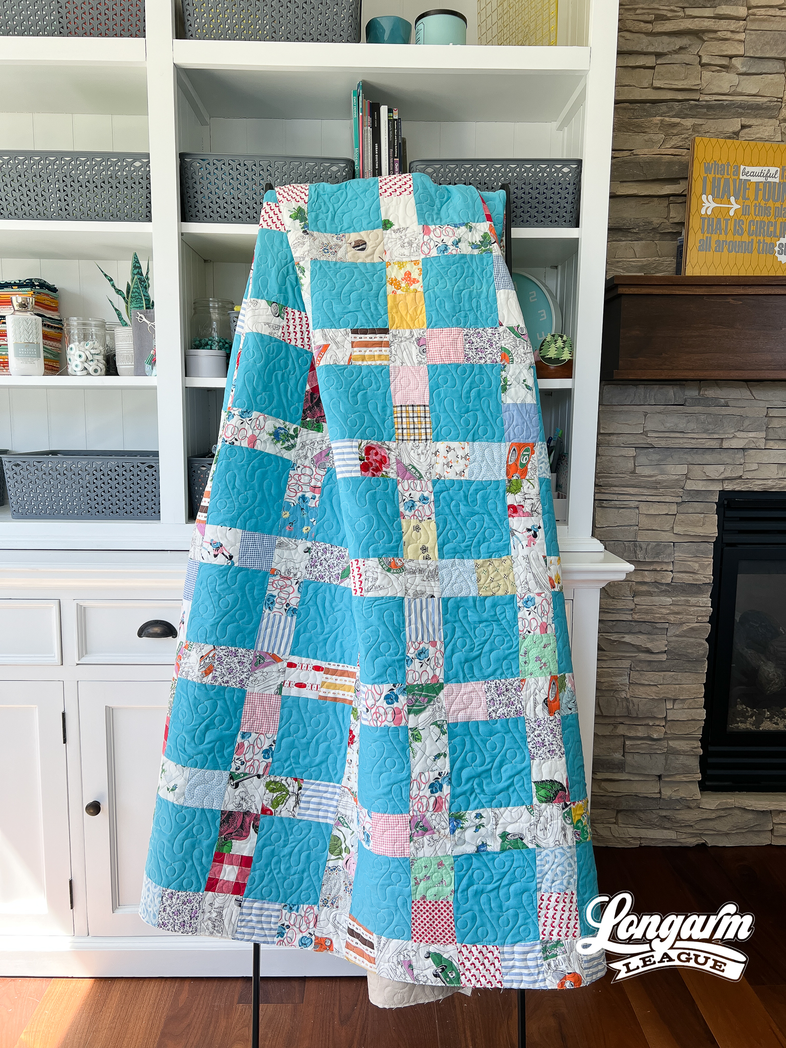
Always Digital Quilting E2E Design
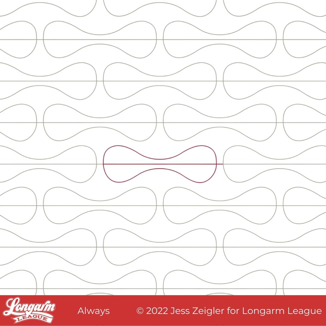
Always is a new digital pantograph design that is a breeze to stitch out. The curvy contours of this shape work so well in providing a pleasant contrast with the straight lines and angles of most patchwork.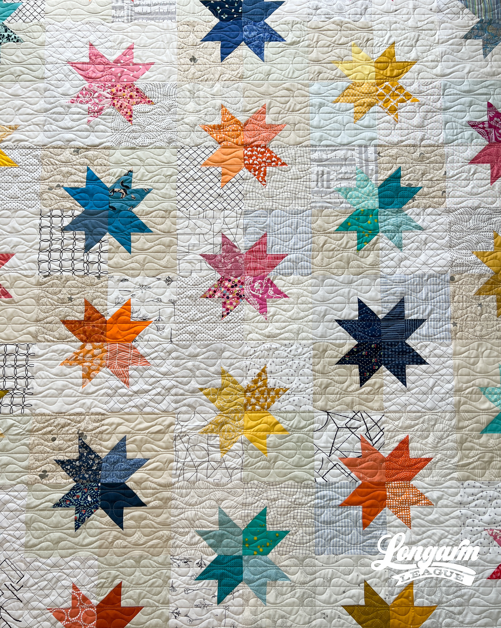
There's a retro feel to this design, too, but will fit the "mood" of many contemporary or modern quilts.
The Name
You might know from reading my previous blog posts that I often use a working title for designs before they get released and need a "real" name. Well, the working title for this one was Lightdays because of the shape resembling a pad. And well, growing up I could count on that particular brand being tucked away in the bathroom cupboards, so that's what my mind went to. My sister thought this was hysterical when I texted her the design with the name, and that's all that really matters. 😂
But obviously I couldn't actually use Lightdays as a name. I didn't want it to be THAT obvious or cause anyone to avoid using the pantograph because of the name. I asked my fr...
Sketch Digital Pantograph Quilting Design
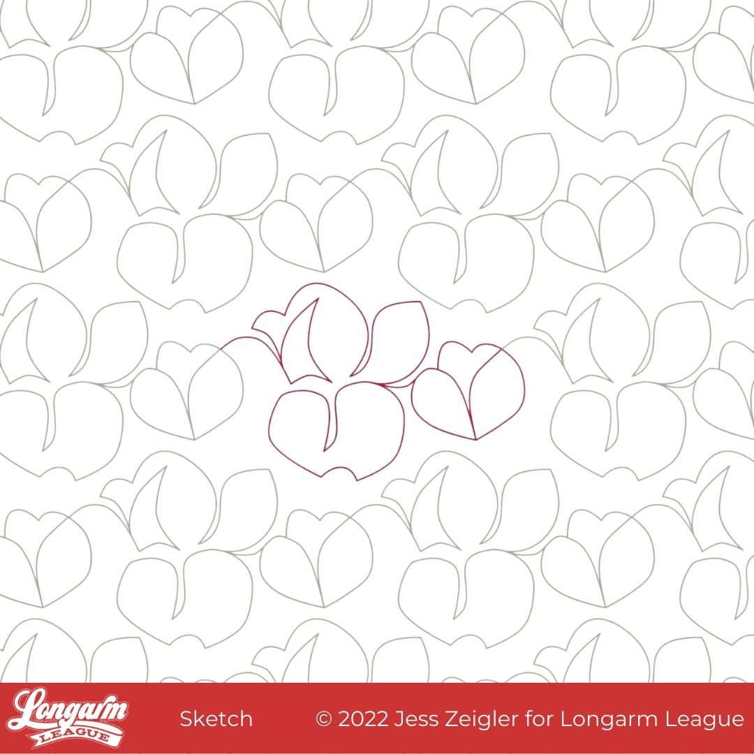
This is Sketch! Up until very recently, I'd planned to name it Cottonwood but when I discovered that's already another designer's pantograph name (with a related hashtag). I decided to go off-script and name it something unique.
The only trouble with having a really abstract design that could look like one hundred things and also nothing? Naming was hard. Why does it seem that I either have great name right away or I'm stress-listing stream of consciousness options and calling on friends and family for help? There's no in-between!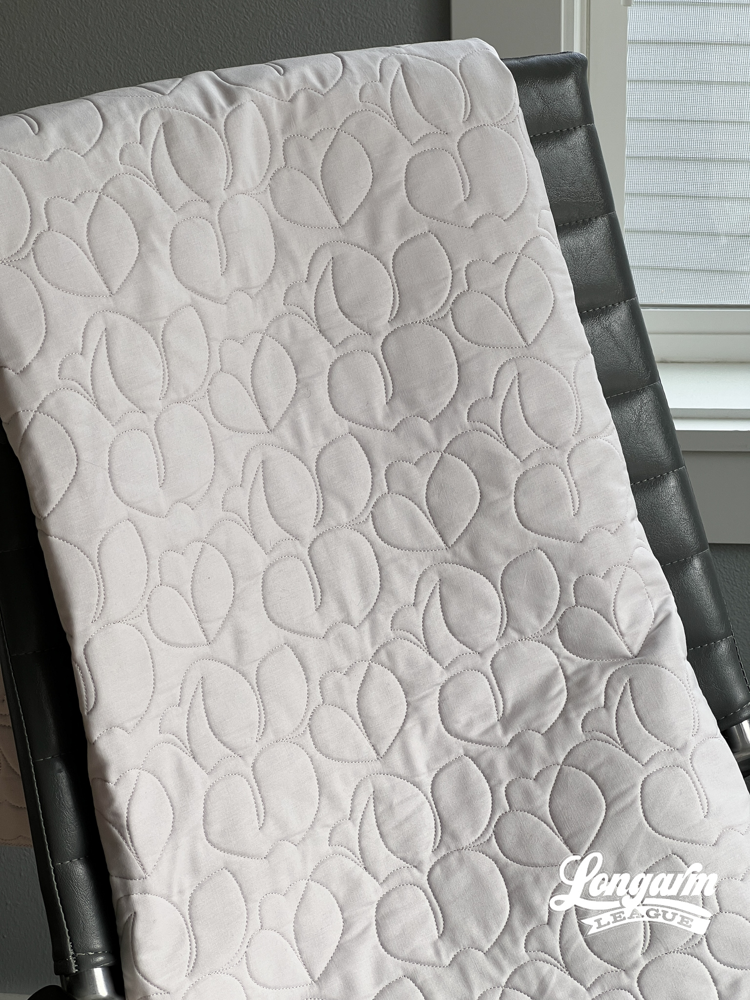
What I like about this design is that it's much more abstract and off-kilter than designs I normally create. There's a fun energy to this design—a bit folksy and quirky. I'm ordinarily not one to use negative space when it comes to pantograph designs, but I have to say that I like the organic-looking spacing of the motifs between the rows with this design. It looks more free-flowin', like a sketch!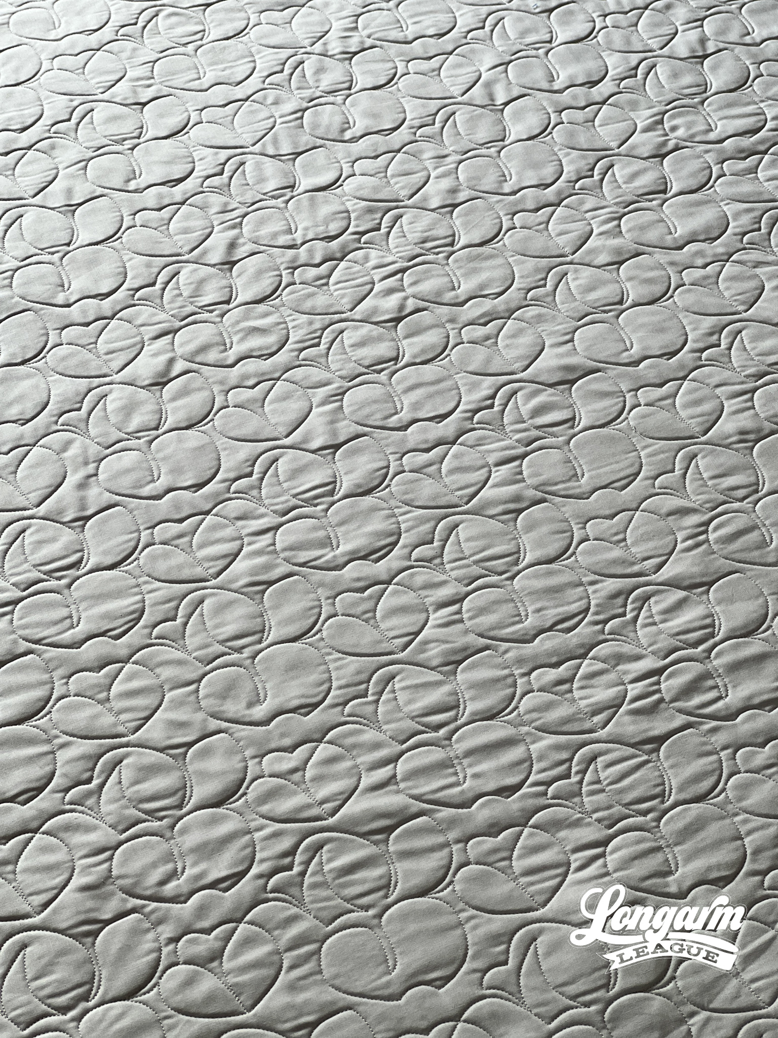
I also like that the overall texture reads as ro...

Jess Zeigler
Longarm League Commish & Owner of Threaded Quilting Studio, LLC.


